KORSVIP launched well and kept improving, but not at the rate the business expected.
The question we started from: “How can we create excitement around the loyalty program for people who shop our site”
Michael Kors · KORSVIP loyalty · 2017–2019
KORSVIP launched well and kept improving, but not at the rate the business expected.
The question we started from: “How can we create excitement around the loyalty program for people who shop our site”
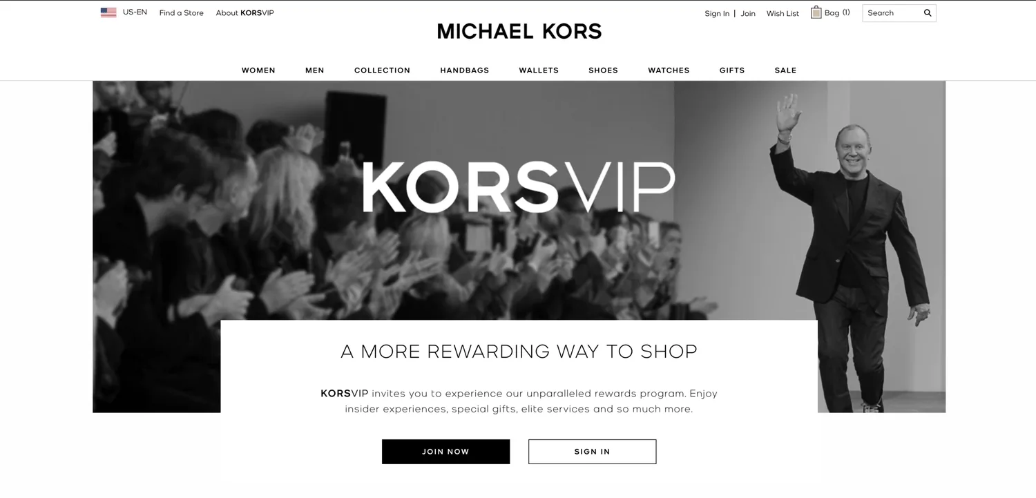
I led the UX: defining the strategy and shipping the sign-up in the shopping bag. I worked closely with engineering, analytics and a visual designer, and with several PMs to sell the vision to the leadership team.
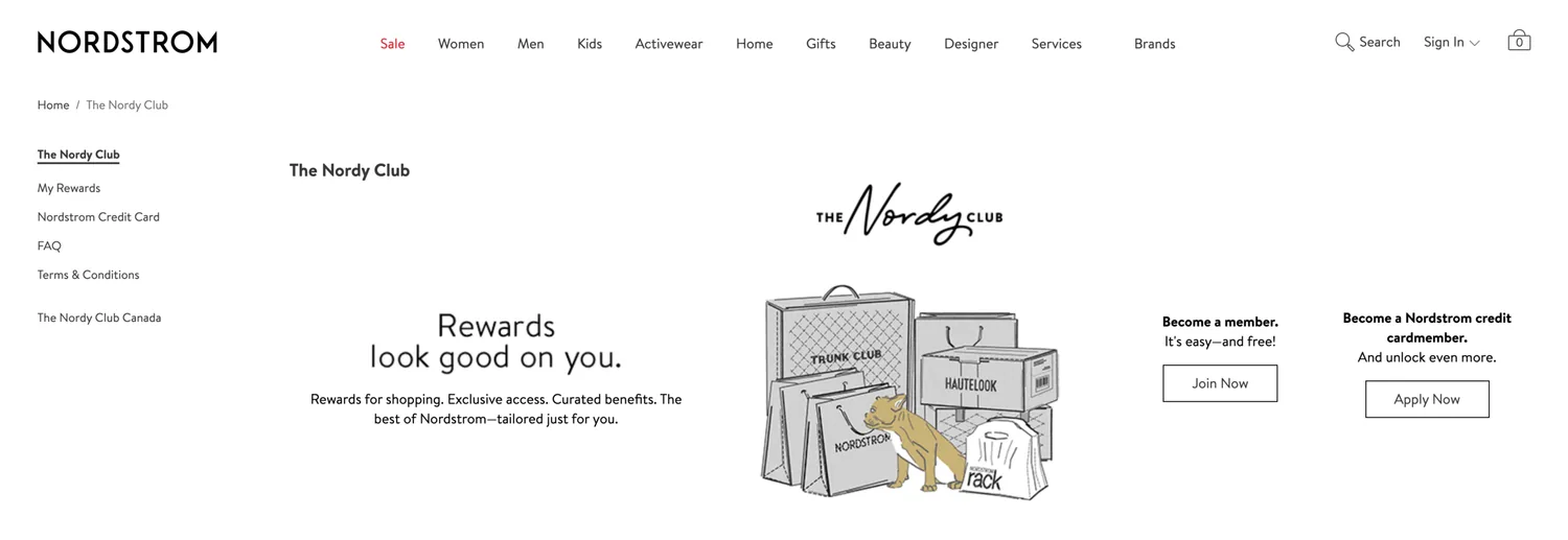
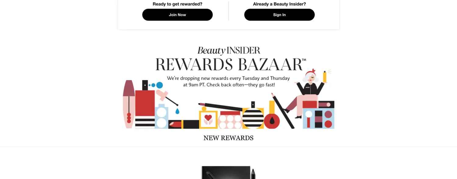
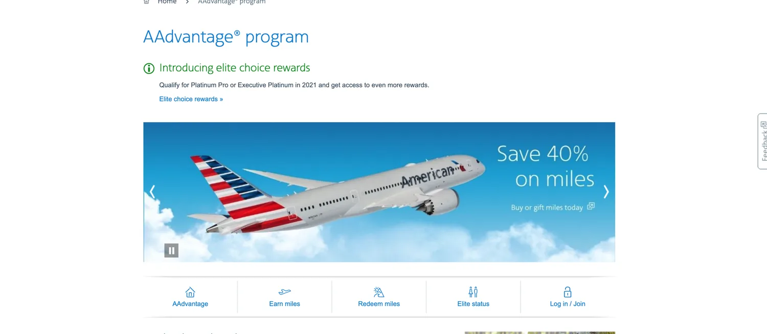
I studied the product, bag and checkout flows of brands with strong membership programs, including Sephora, Nordstrom and American Airlines. Then I asked where in the journey a join prompt would be most compelling. The answer was the shopping bag: the shopper has already decided to buy, and the perks are concrete. It had to help them, not get in the way of checkout.
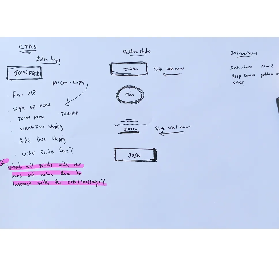
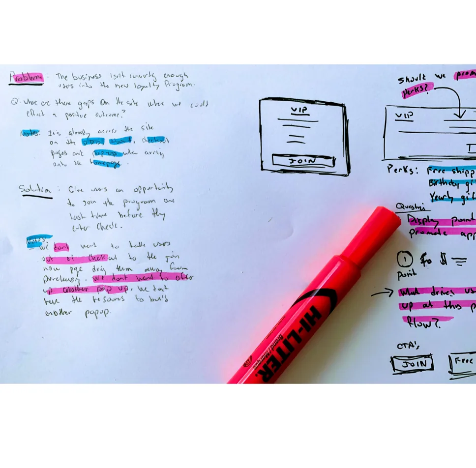
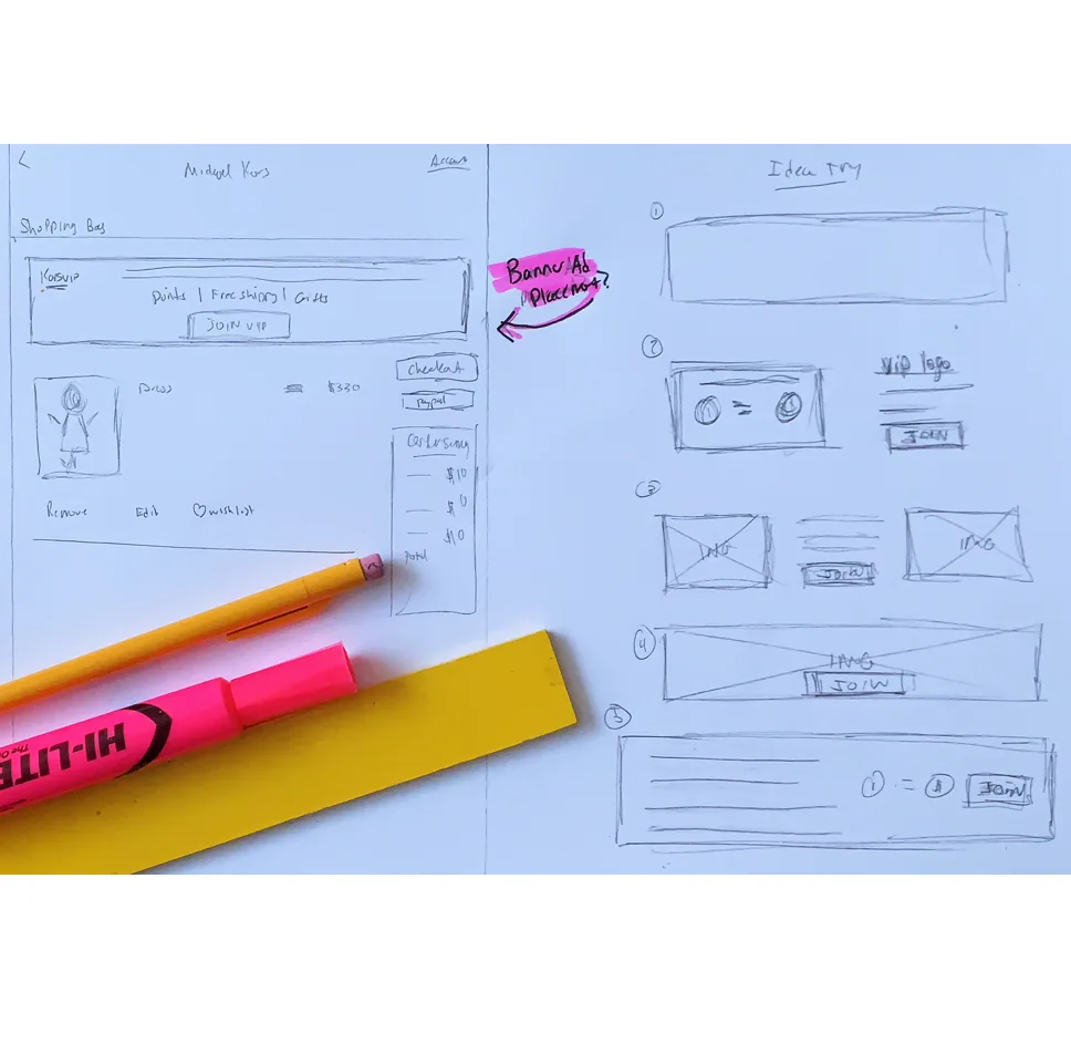
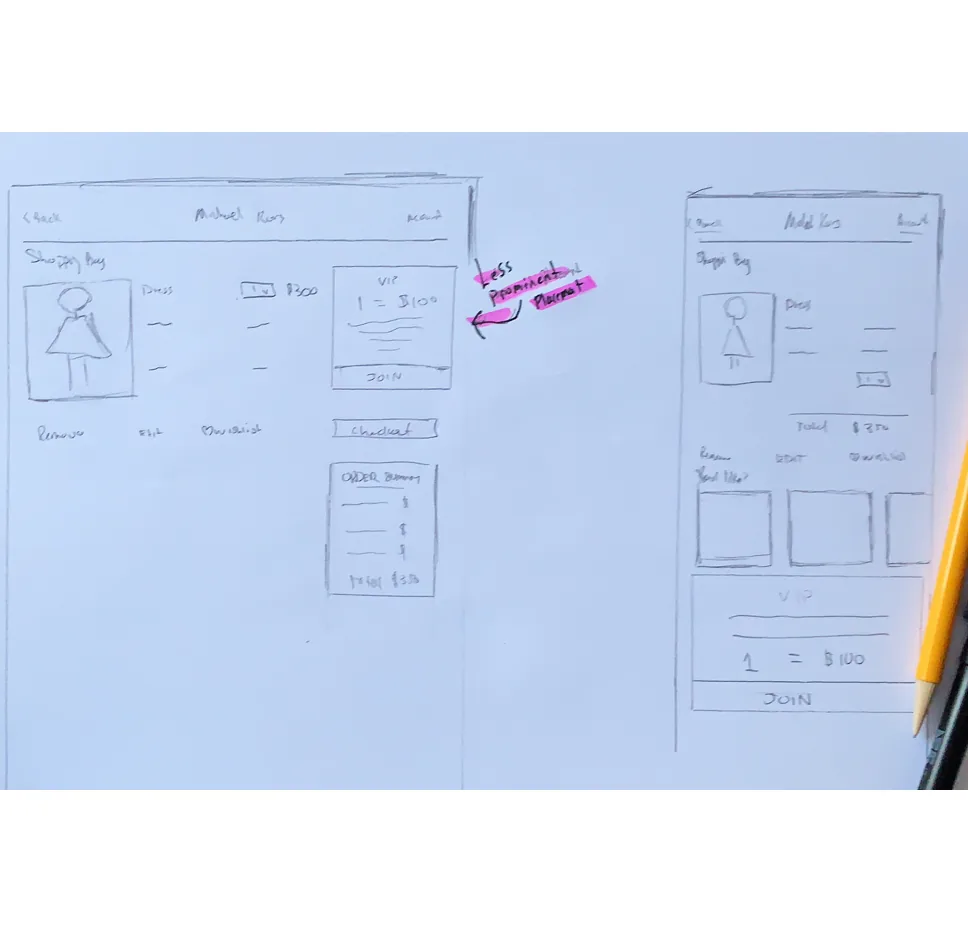
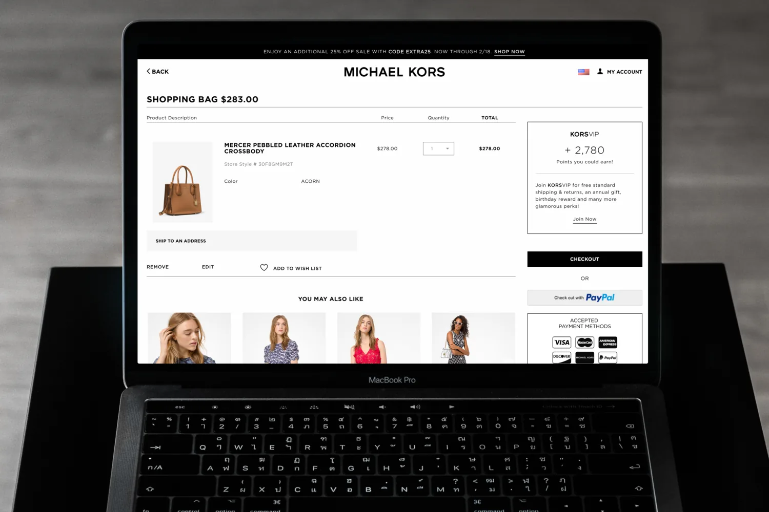
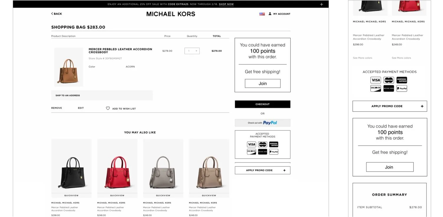
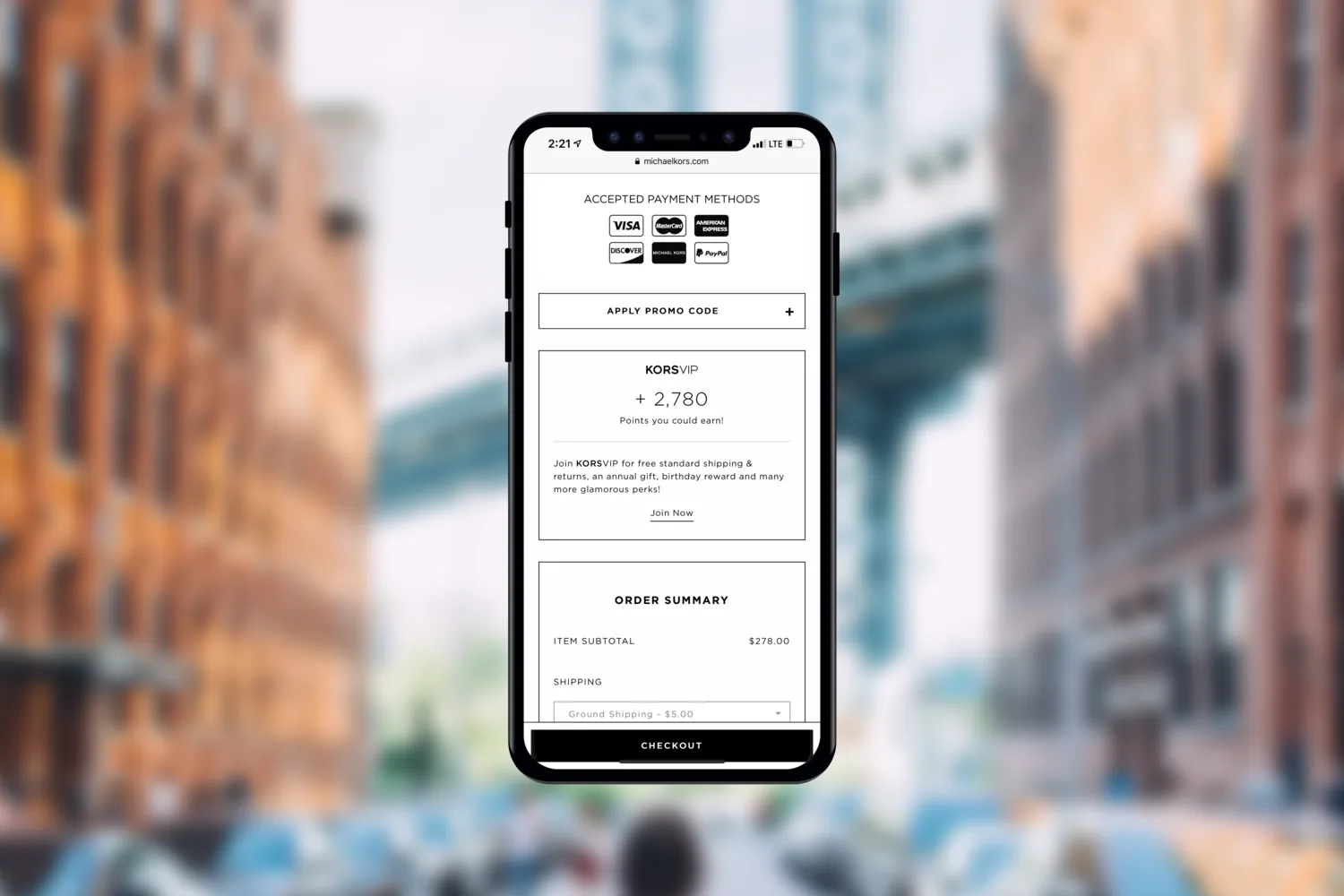
A simple join module that led with free shipping, a top benefit for most shoppers, and showed the points this order could earn. Seeing the reward on their own purchase taught shoppers what the program was worth.
We watched it for five months with Hotjar recordings and analytics. The shopping bag became one of the top two places shoppers joined, accounting for 17.4% of all sign-ups, with a 5.1% click-through rate and 34.4% conversion. 62% of those conversions came from mobile web, 30% from desktop, and the rest from tablet.
I co-led design of Michael Kors' first native apps. They beat the sales goal by 100% in under six months.